UI / UX
Aaron Stacey —
I’m a designer and developer with strengths in UX research, graphic design, Adobe Suite, Figma, and web development, and I enjoy building clean, high-performing digital experiences.
Experience
2020——2026
I’m a designer and developer with strengths in UX research, graphic design, Adobe Suite, Figma, and web development, and I enjoy building clean, high-performing digital experiences.
University Center Grimsby - Branding for Creative Department
Nasturtium - Advertising Campaign Design
Cases
25+
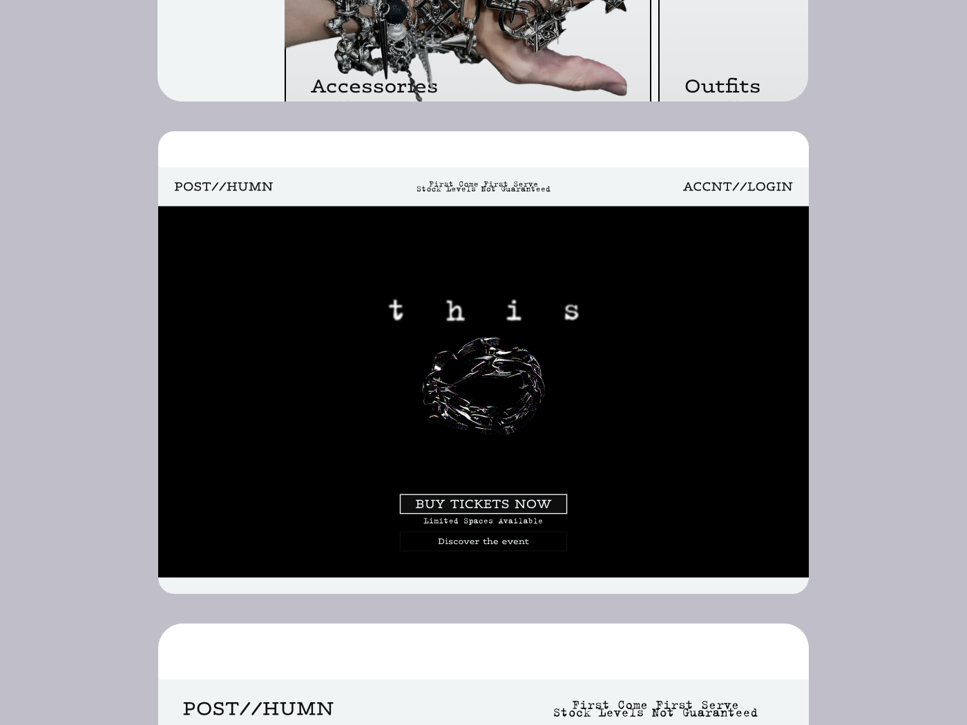
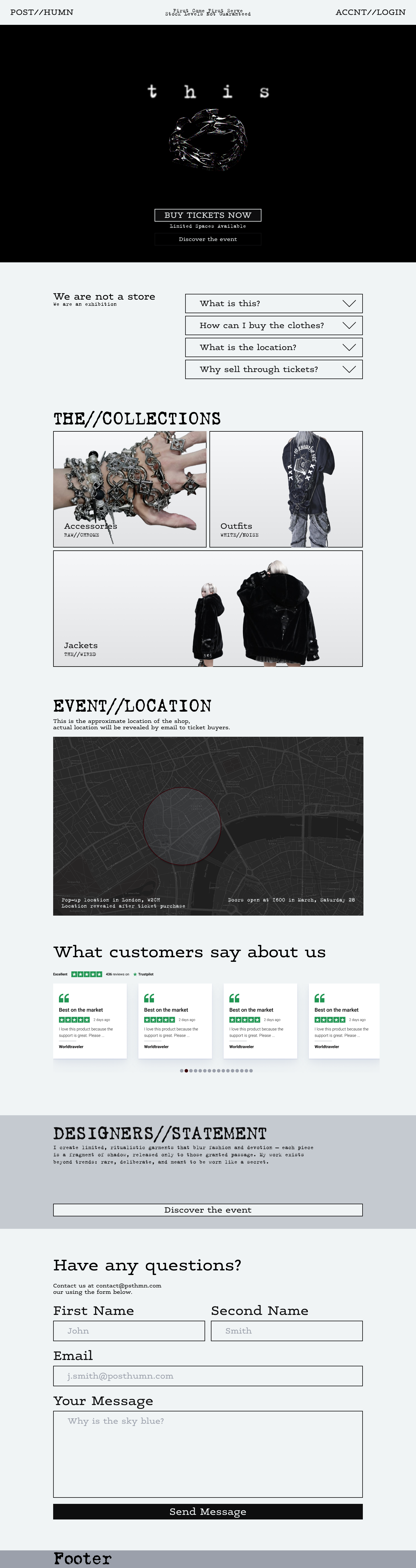
This website is designed for a one-off event ran by a famous fashion designer. The event is a one-off drop where the designer will present his work at a ticketed exhibition, after which atendees will be free to take away the clothing included in their ticket.
POST//HUMN
↳see full study
close ↵
project
POST//HUMN

platform
figma, framer
live site
This website is designed for a one-off event ran by a famous fashion designer. The event is a one-off drop where the designer will present his work at a ticketed exhibition, after which atendees will be free to take away the clothing included in their ticket.
work process
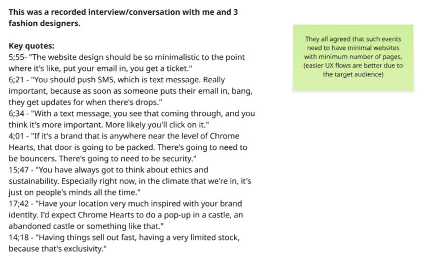
To start off, I've gathered a group of friends at a pub for a chat about this idea, this was very useful as they are all streetwear fashion designers or fashion design students. After getting some isnsight into who is interested in this, and some potential problems with the event I moved to finding the target audience.
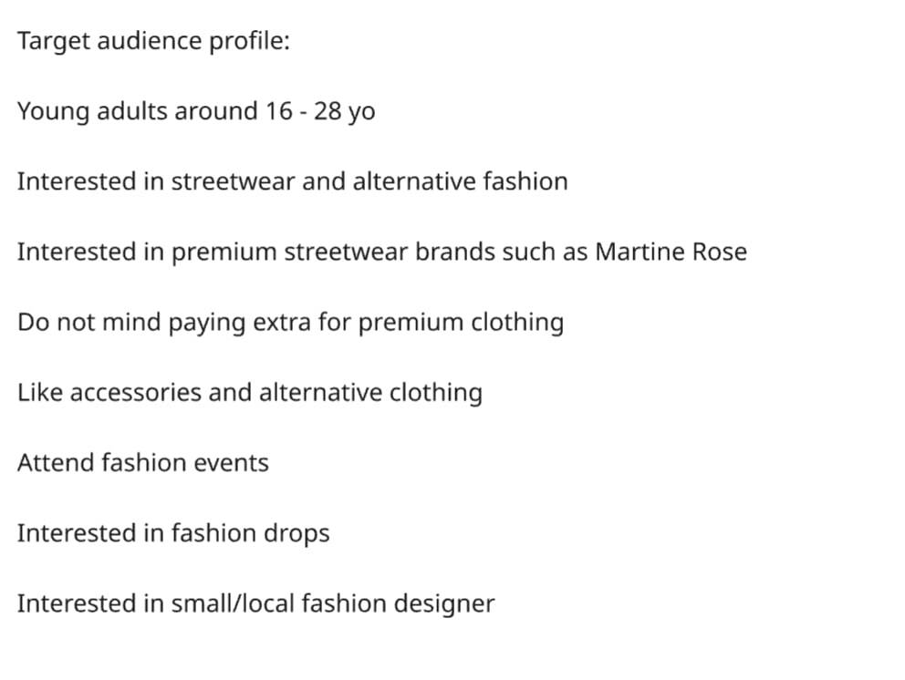
After some research on statista and the conversation I had I plotted my target audience for this even which one on my fashion designer friends confirmed to be accurate for streetwear
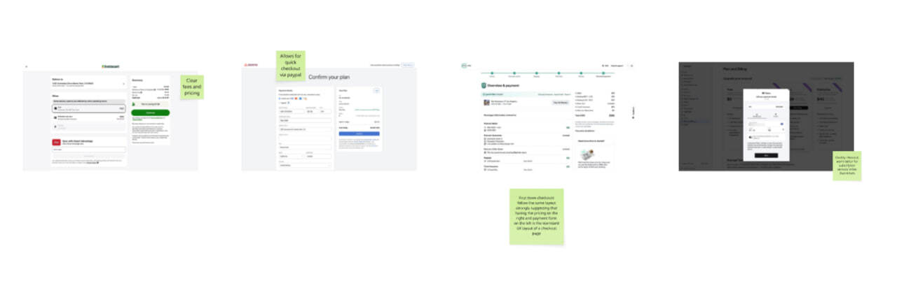
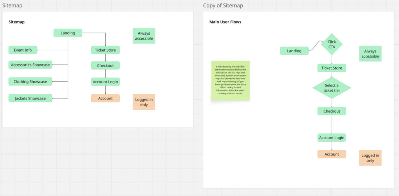
I've researched successful user flows for booking tickets and based of them created a site map and a user flow based of the flows I analysed and the context for this website.
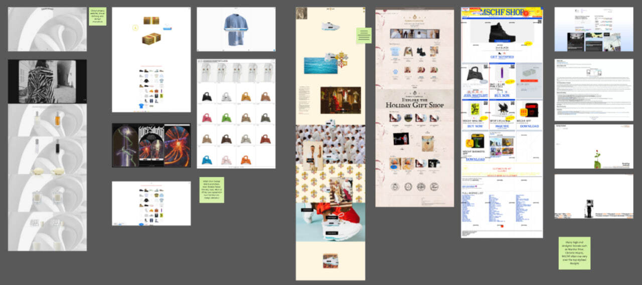
For inspiration I've analysed different fashion event designs within the same category of fashion.
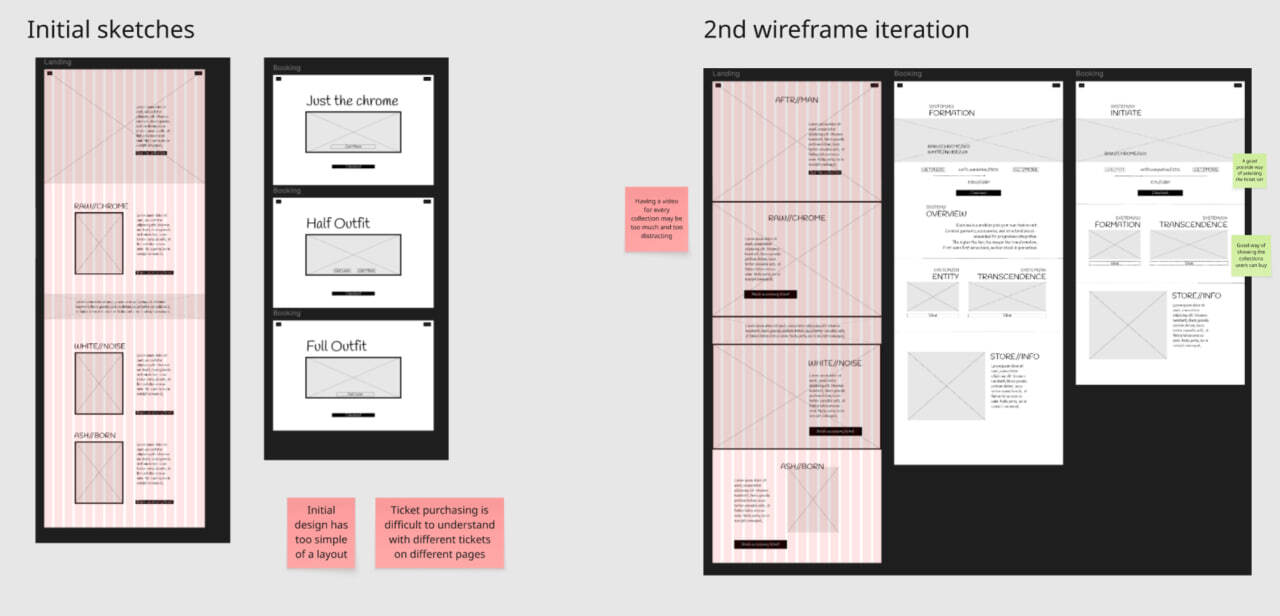
I've iterated through different low-fi ux sketches and mid-fi sketches checking them with other students in my class for feedback until I was happy with the designs.
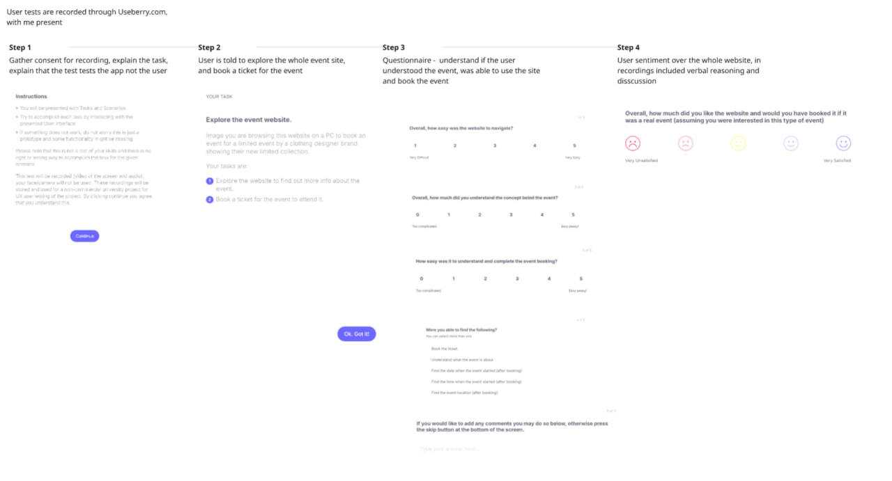
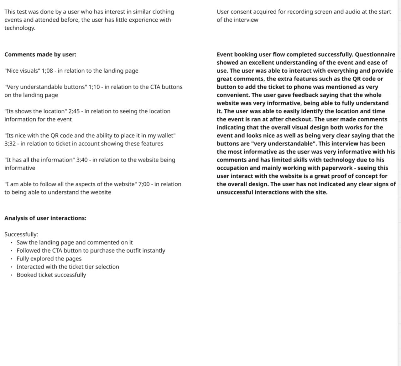
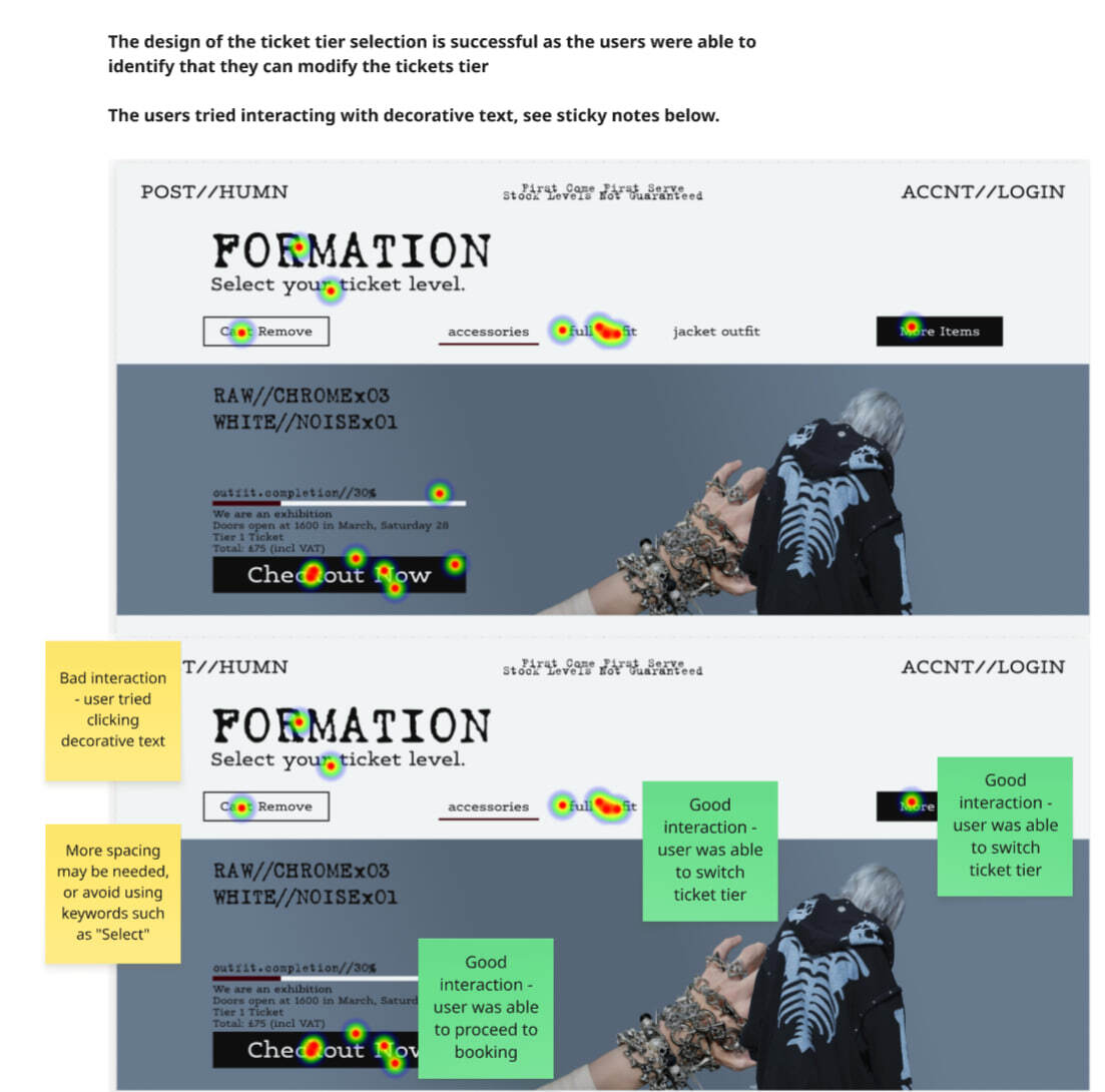
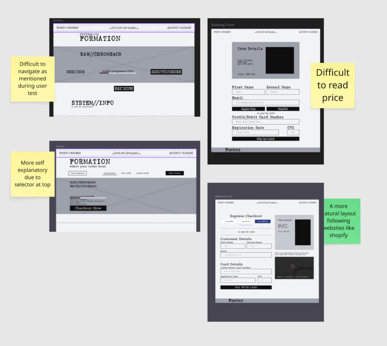
For testing the designs I've set up user tests with Useberry on my Hi Fi prototype, and I then analysed the verbal feedback I've gotten along side the tracking and heatmaps around the prototype.
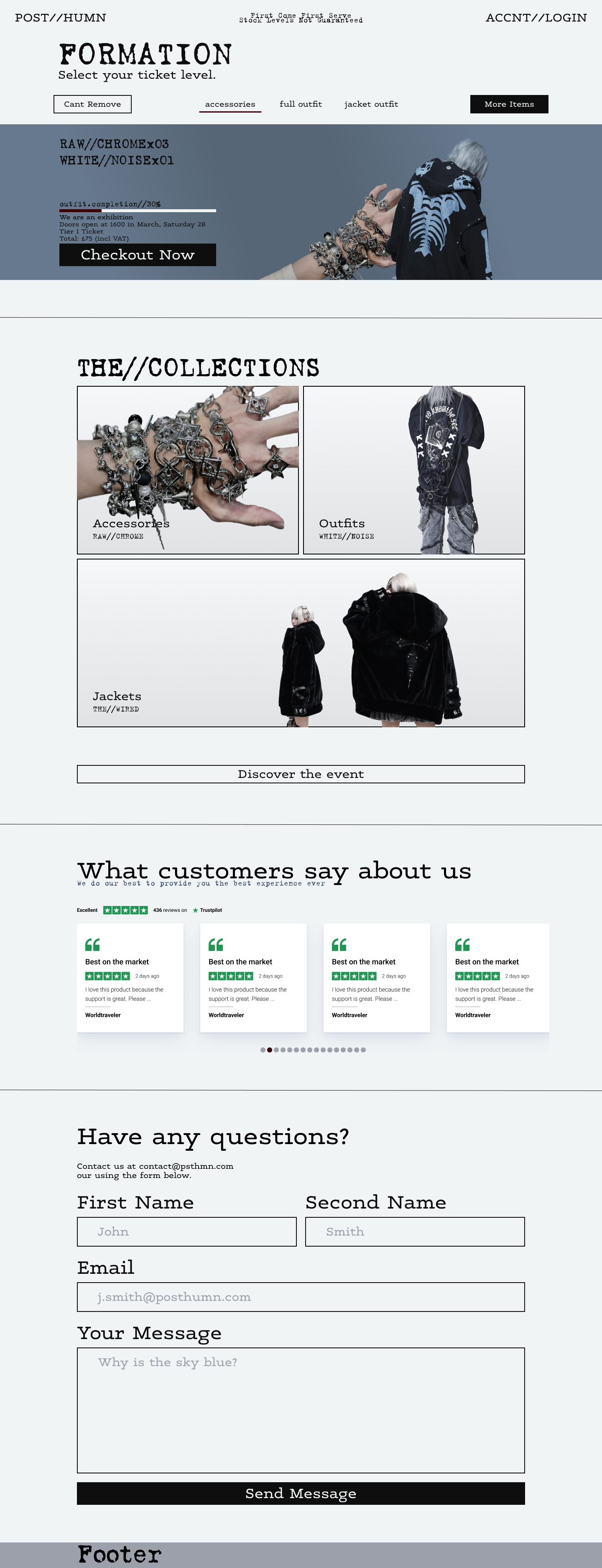
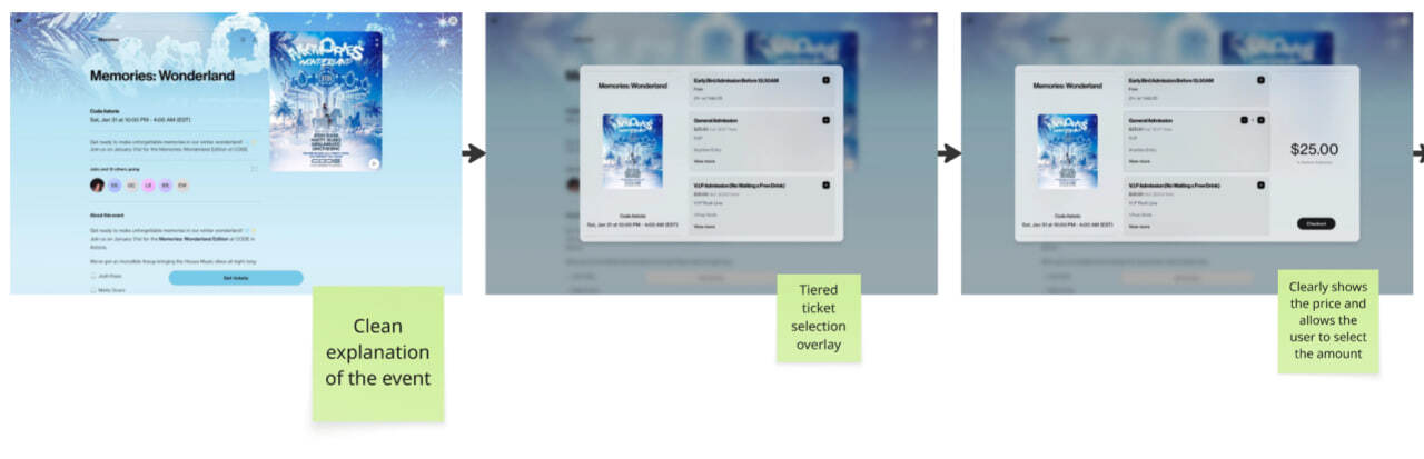
After 5 rounds of tests I was happy with the design, and these are 2 most important pages from my website. Overall, this was a great learning experience and a great way to test ideas and anti-design movement through actual user tests and feedback.
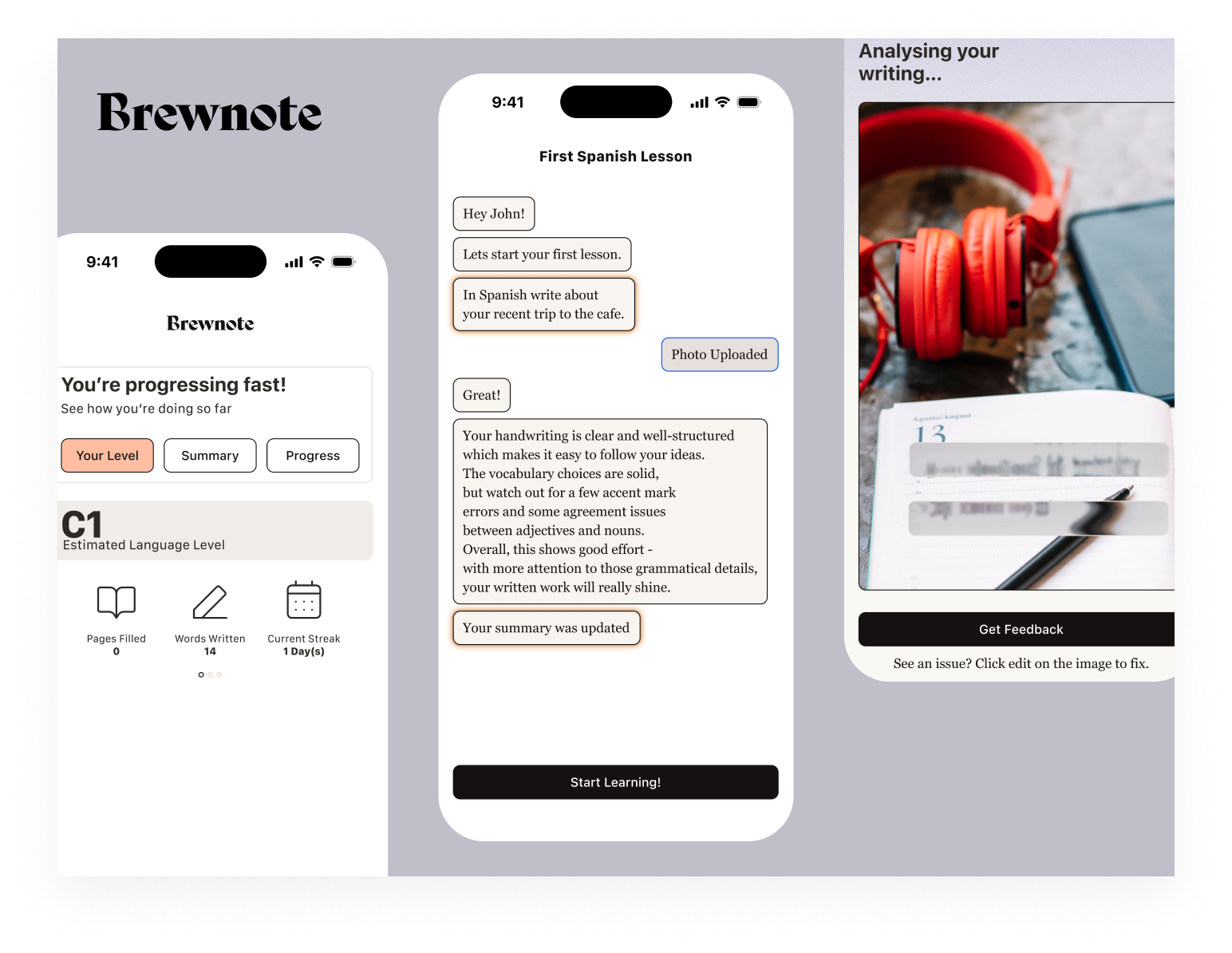
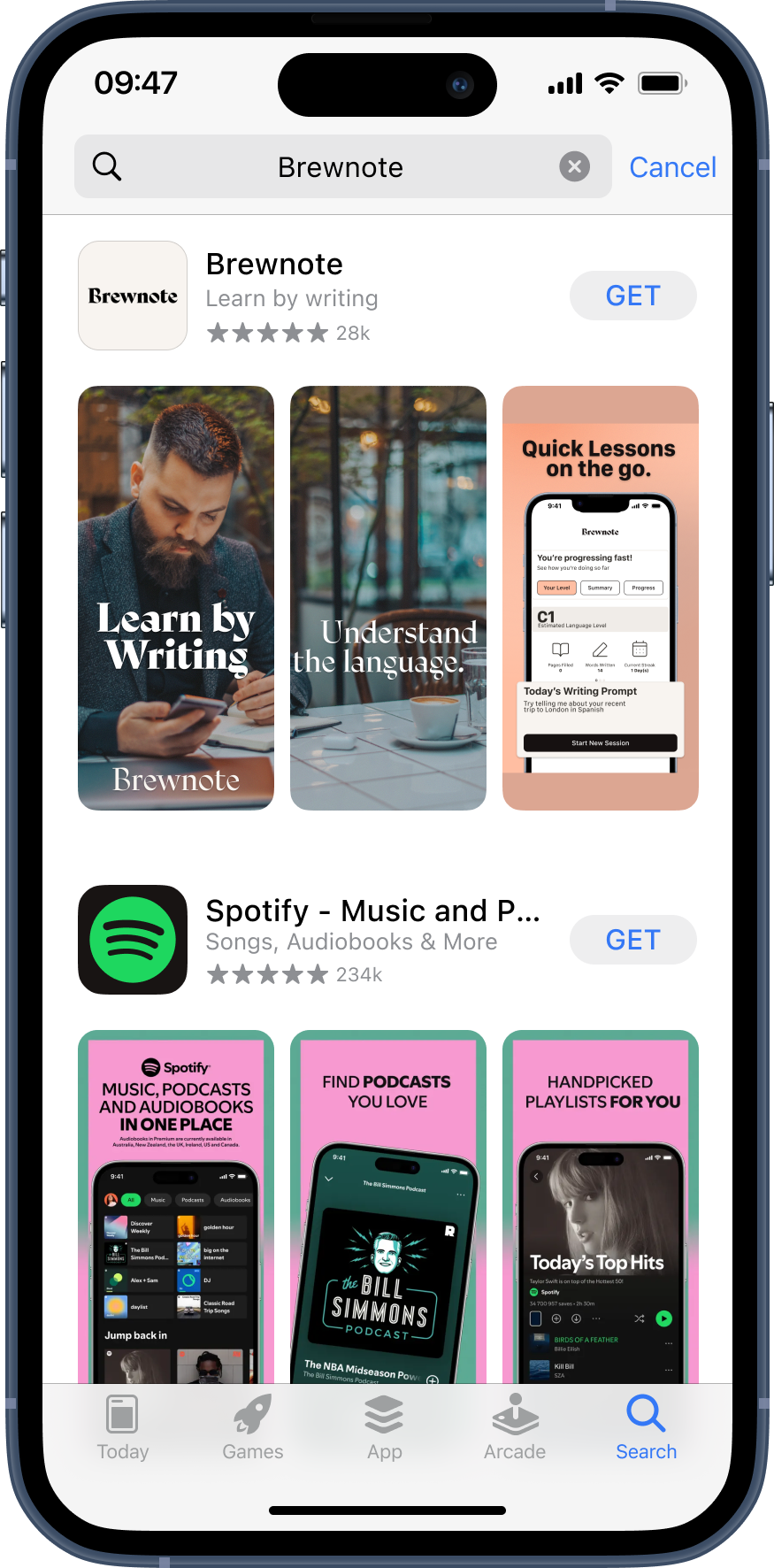
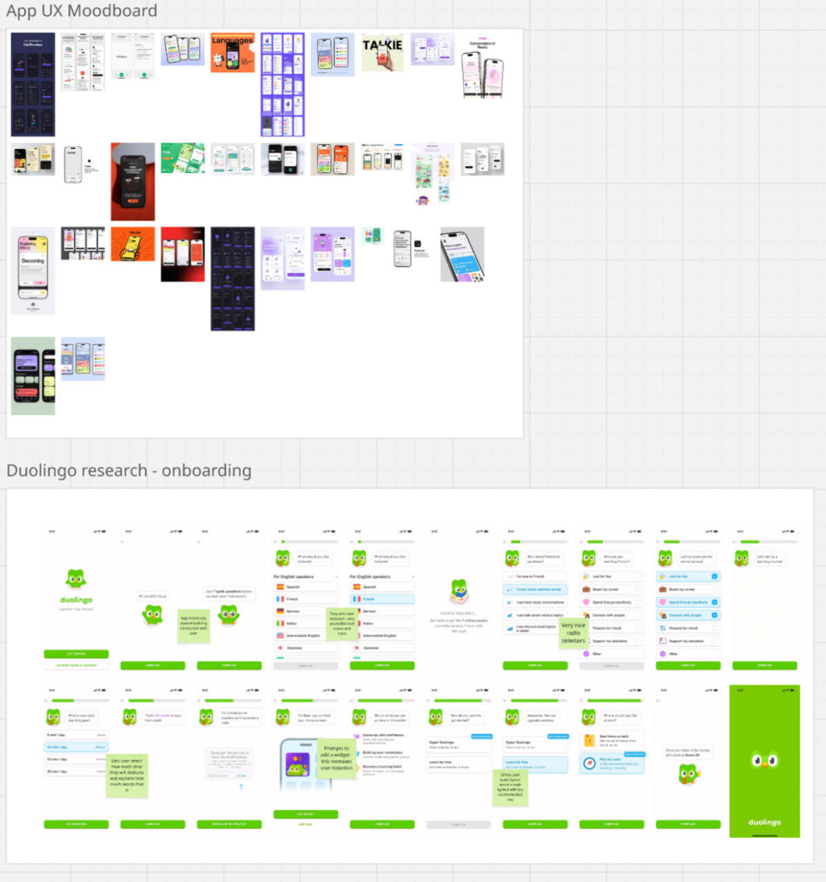
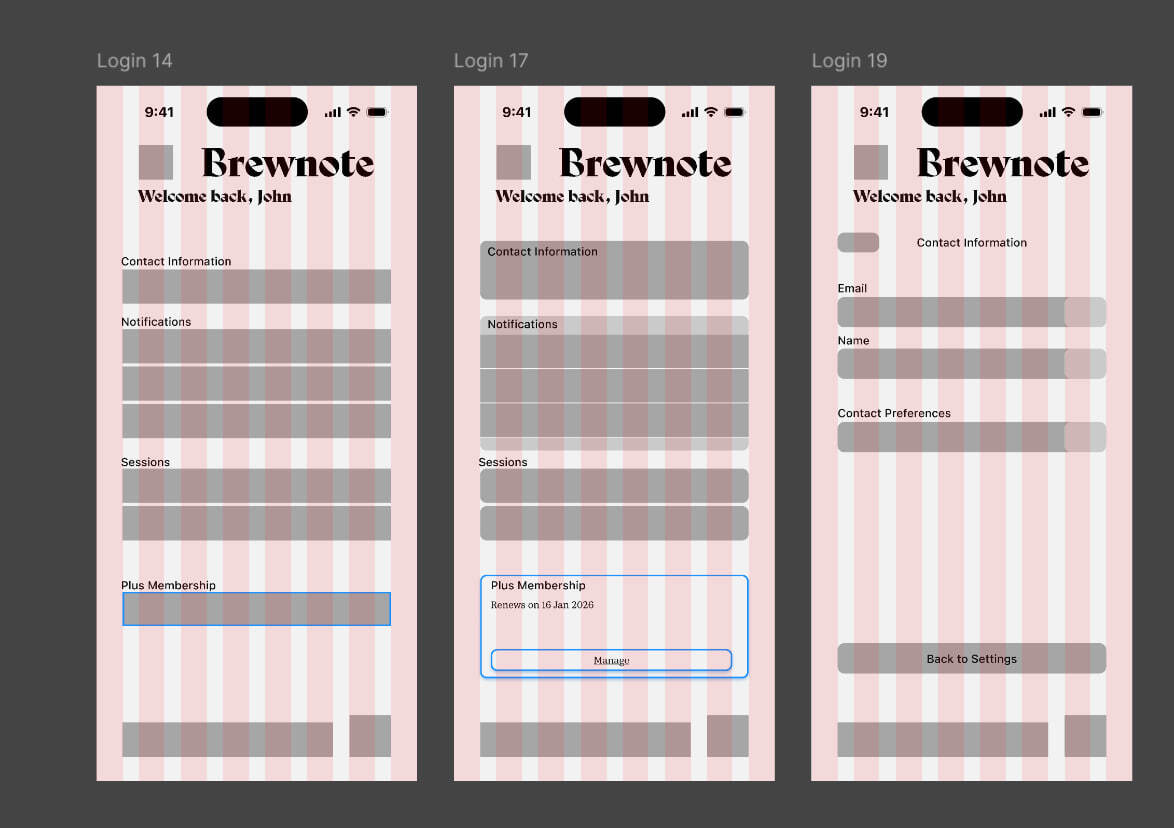
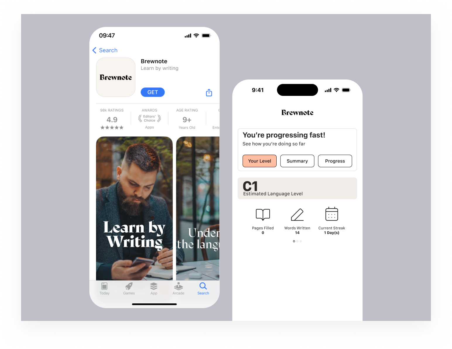
This is an app that will help people study languages quicker and connect with each other - studying a language is already hard, and when most apps gamify the experience they make it even harder. Brewnote gives you real lessons with hand writing so you never forget what you've learned, without any gamification at all.
Brewnote
↳see full study
close ↵
project
Brewnote
platform
figma
This is an app that will help people study languages quicker and connect with each other - studying a language is already hard, and when most apps gamify the experience they make it even harder. Brewnote gives you real lessons with hand writing so you never forget what you've learned, without any gamification at all.
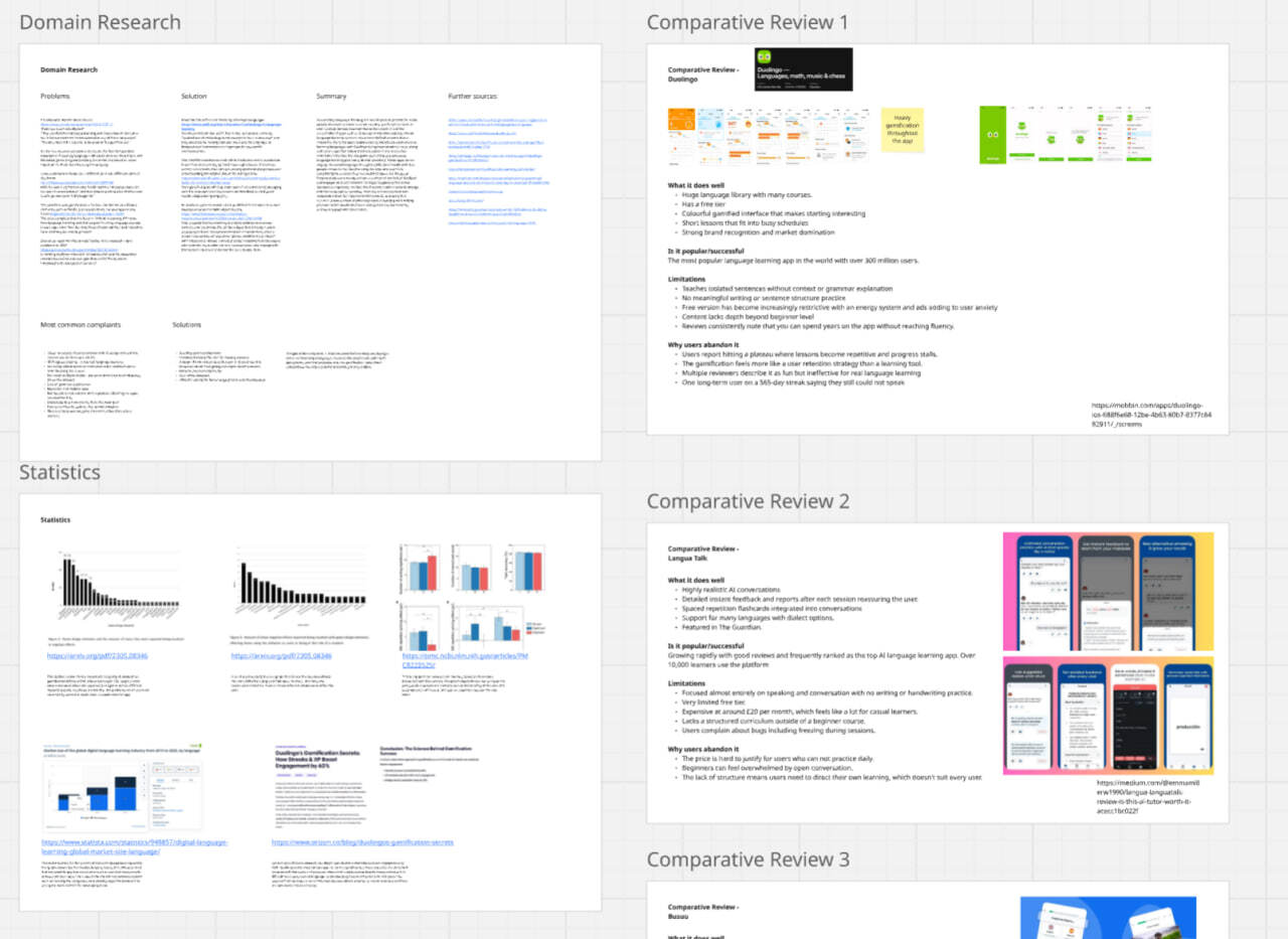
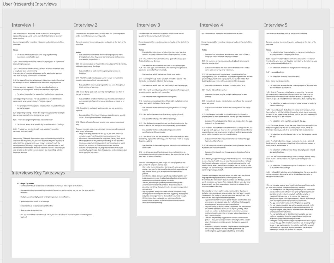
In the research phase I've gathered ass much info as I could about the issues surrounding language learning and analysed existing apps, as well as ran interviews with potential users
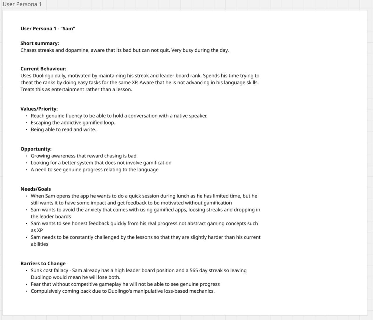
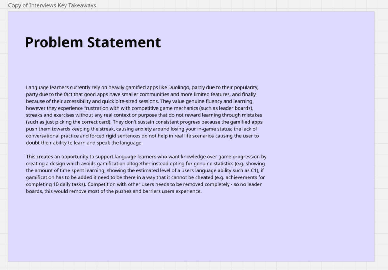
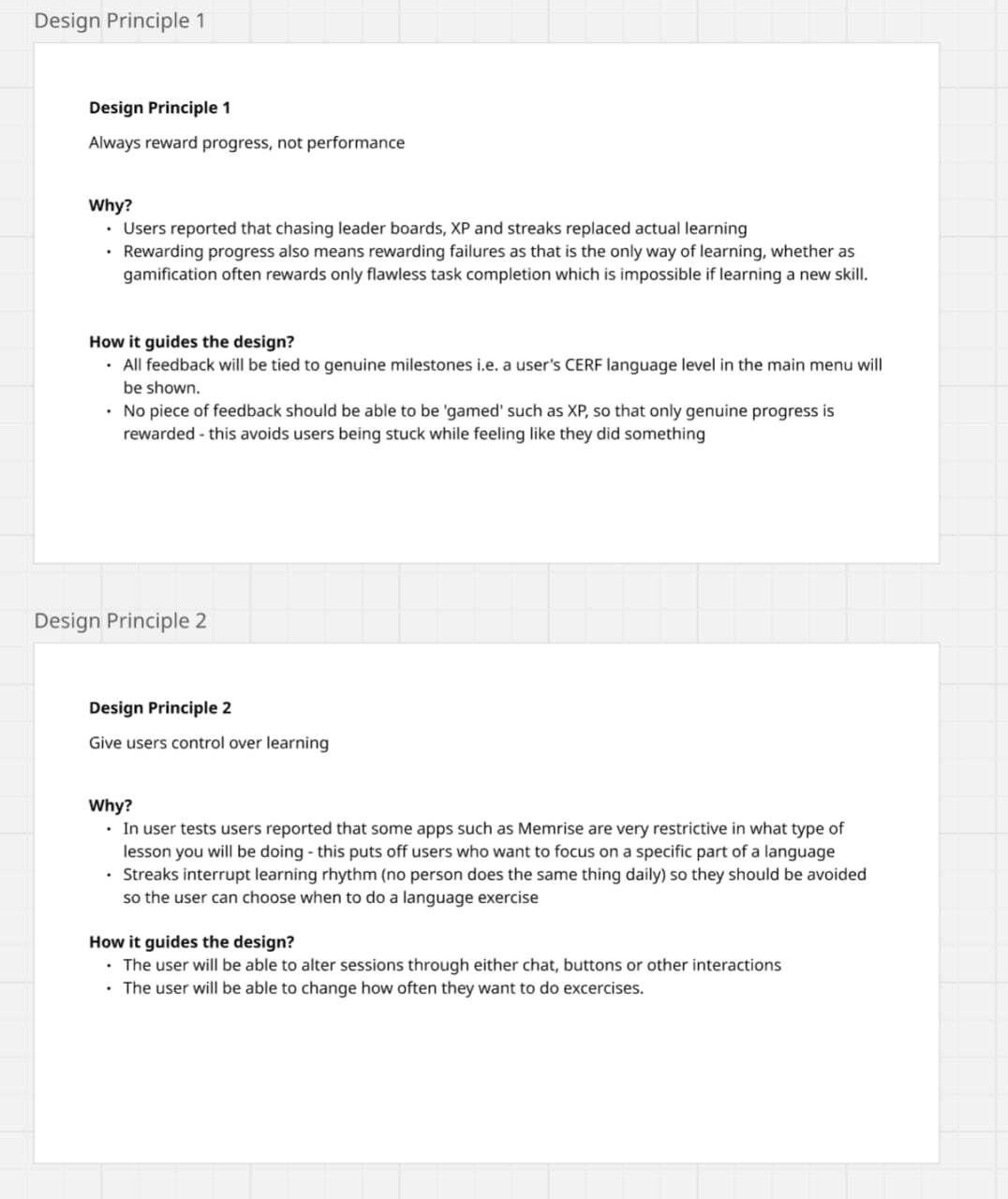
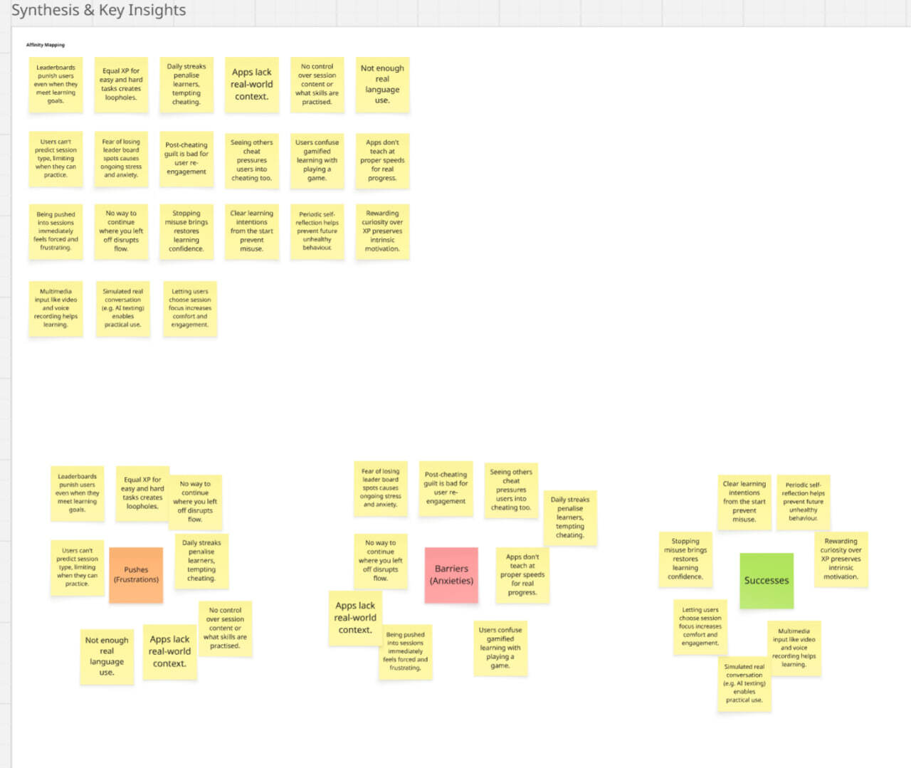
After creating a problem statement, identifying a user persona, and identifying 5 design priciples I had enough research and a solid foundation to start designing the app.
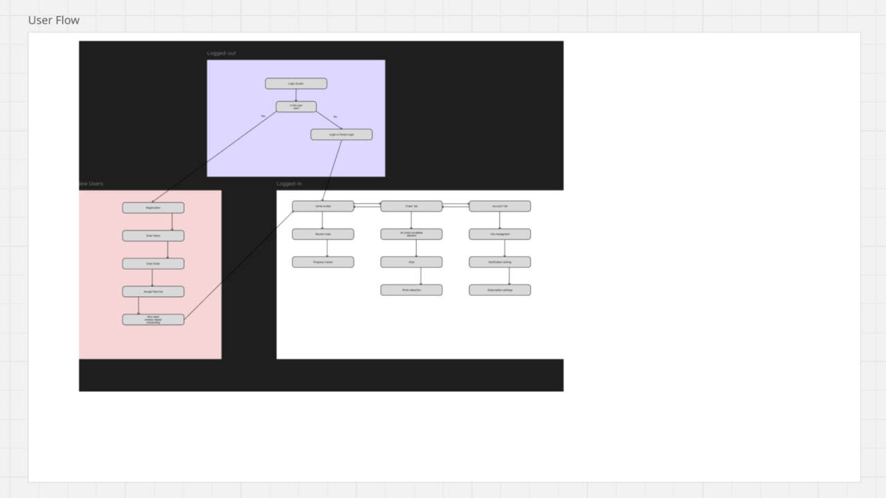
After identifying what I wanted from the app I started doing a lot of research into the user flows of competitor apps, and then created my own user flow diagram.
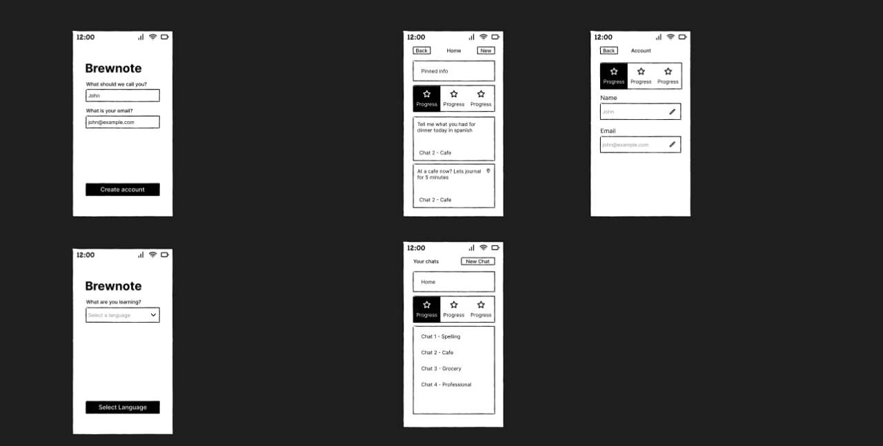
At this point I've started creating wireframes and lo-fi frames which I tested with my class mates and improved.
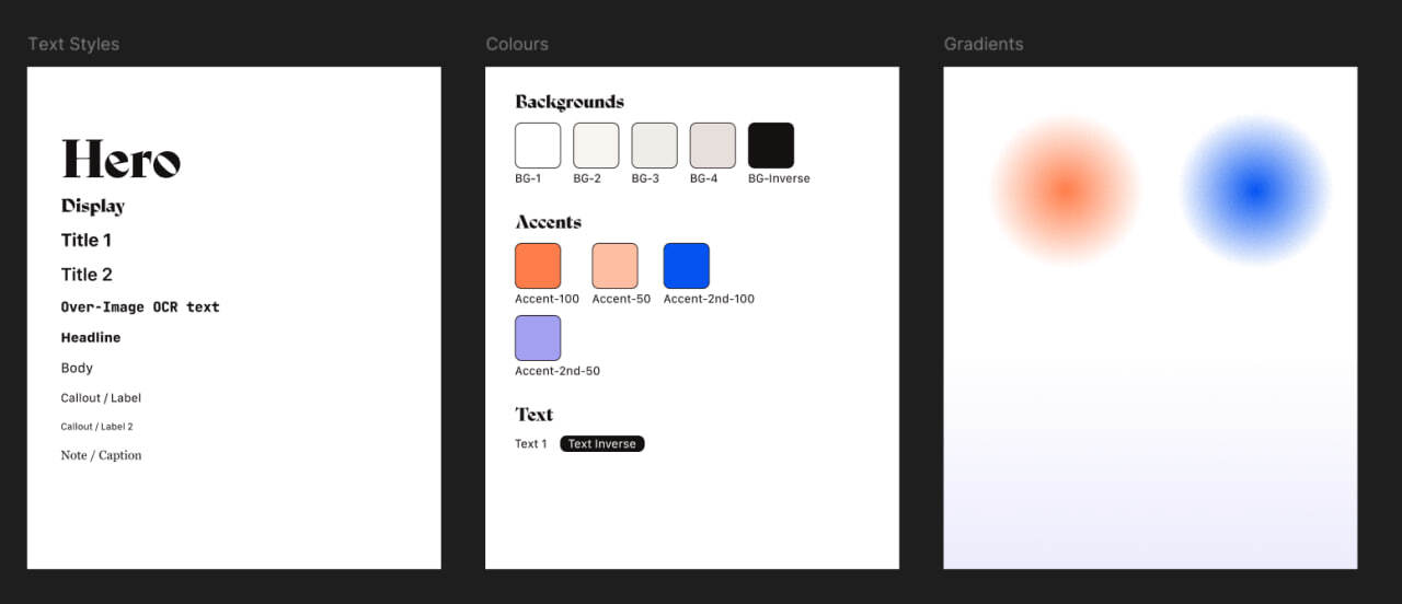
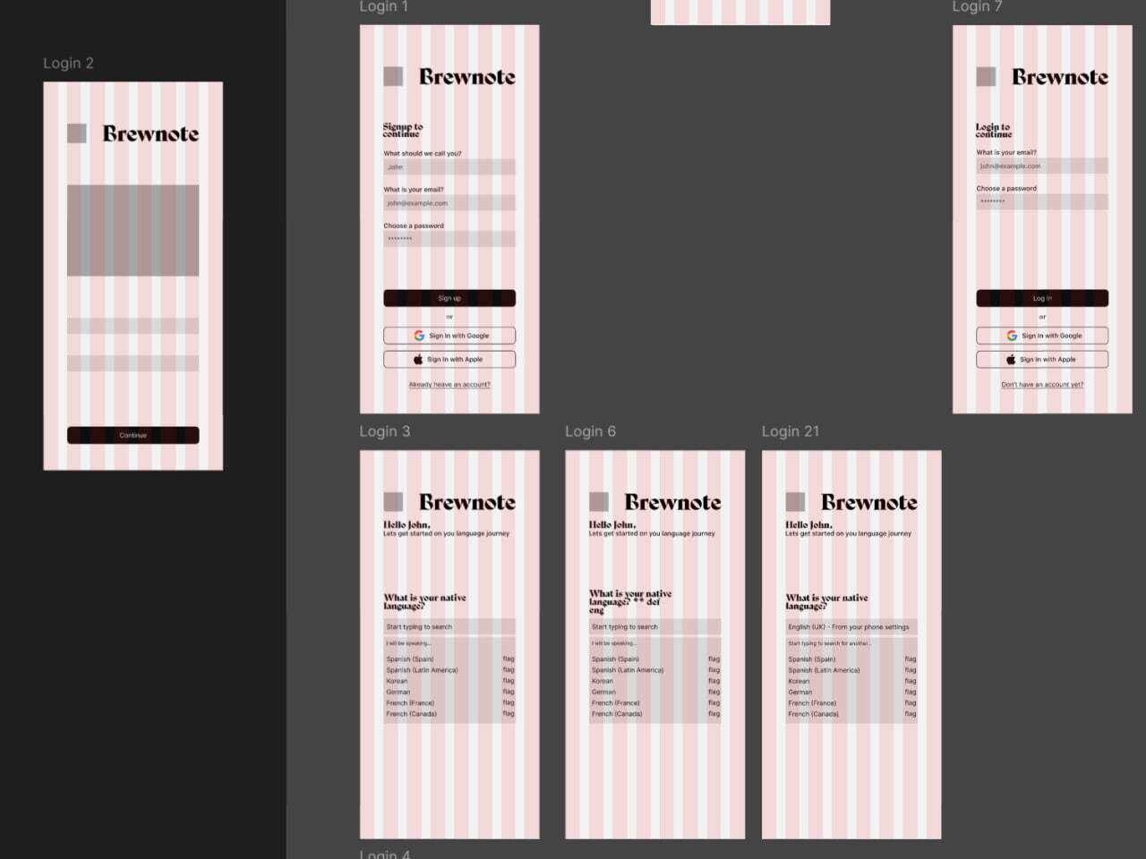
At this point I've started creating Mid Fi frames and thinking about the overall design of the app, the fonts, font sizing and design elements.
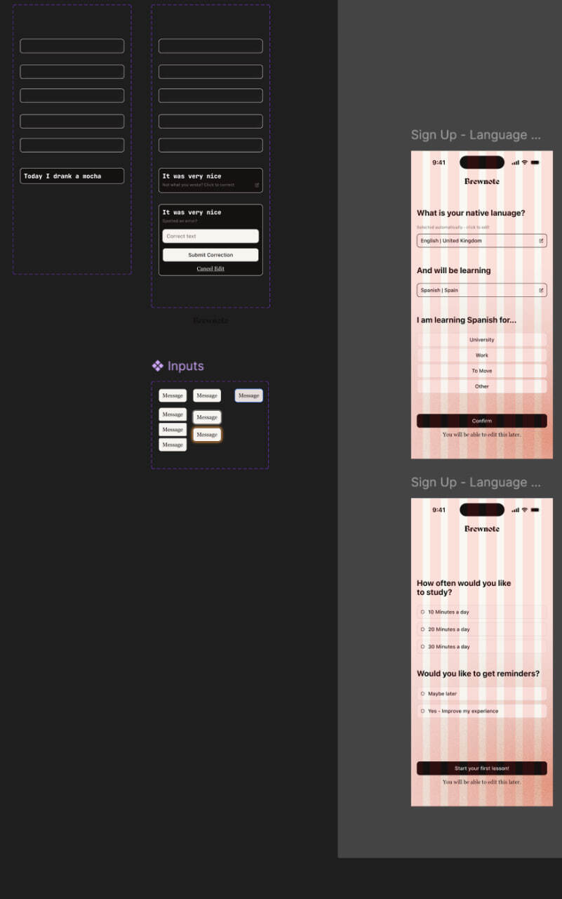
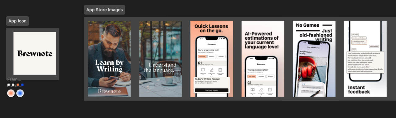
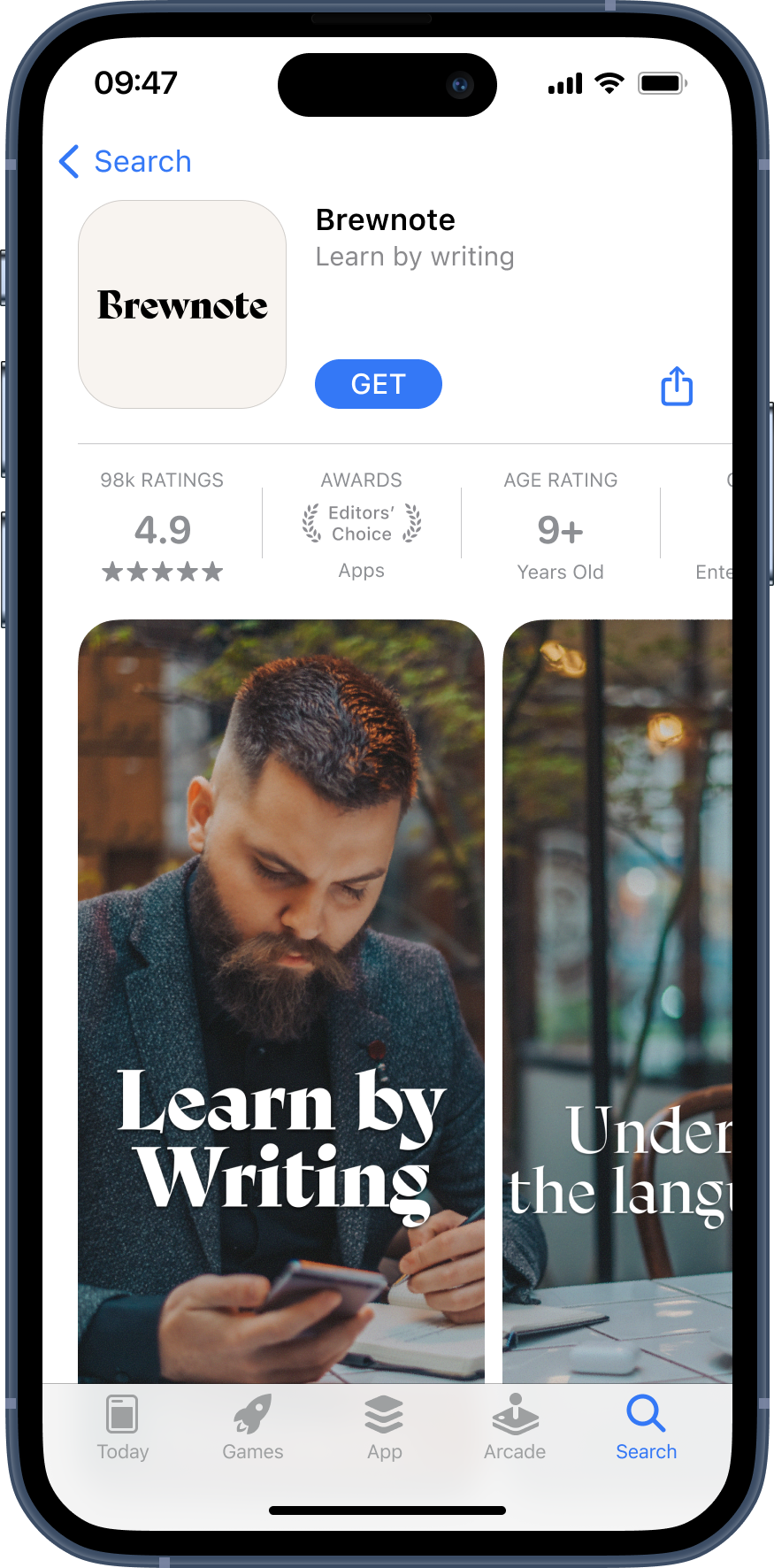
And finally I finished creating my Hi Fi prototype and after that I created some app store images and basic branding to promote the app, if it was ever to be released.
This is mainly a research project in which I worked as a researcher with a team to create a new VTO experience for Blakley.
** Prototype image shown on the right is designed by Viktoria Nevidomska as a part of a group project
** Prototype image shown on the right is designed by Viktoria Nevidomska as a part of a group project
2026

close ↵
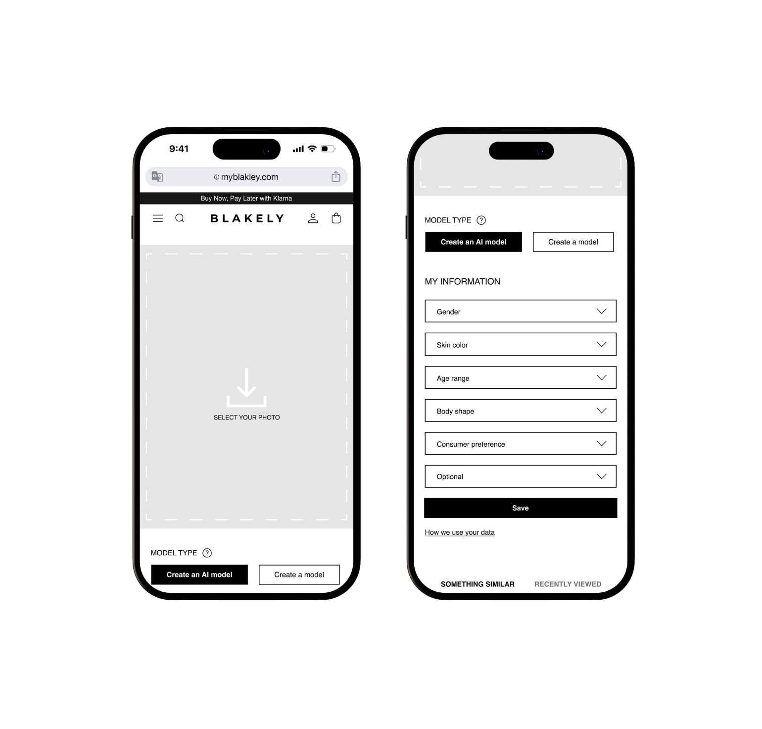
- PROTOTYPES SHOWN DESIGNED BY VIKTORIA NEVIDOMSKA
client
Blakley
Heuristics evaluation as opening move. I started with a Nielsen-style heuristics audit across Blakely's home, product, cart and checkout pages.

I've then ran research into the problems that VTO solves, and how it reduces the return rates in ecommrce stores. Summarising problems with existing VTO solutions that we can fix.

Further research helped me identify even more things people complain about with VTO, it turns out 60% of customers want to see VTO on a website but only 8-10% will actually use it. I've passed this information onto the design team so that they can decide how to solve these pain points.

Further research into data concerns people have when it comes to VTO revealed that throughout different academic writings and online forums people mention concerns over VTO a lot, the graph below shows the severity and likleyhood of the different concerns people have with VTO.

As a request from one of my teammates I've ran research into VTO competitors and VTO dedicated apps, which revealed how they implement it and what UX elements they use. Since VTO takes a while to generate a profile, the main element across all of them were animations and placeholders so the user always gets feedback.

After I got access to the final prototypes I've ran User Tests via Useberry which revealed some insights into different issues that the current prototype has.

After communicating the issues I've found with the team we were able to quickly fix those and produce a solid prototype for a Blakley VTO implementation.
